Six European Entryways That Actually Work
Six European entryways that get the first five seconds of a home right, each built on one move you can copy by the weekend.
Written by Vestados Editorial · 25 August 2026
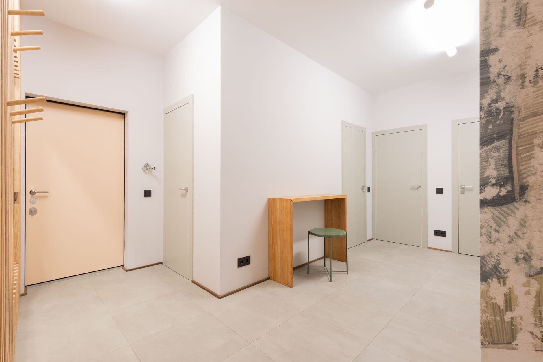
The entryway is the most honest room in the house. It meets you at your most burdened, hands full, shoes wet, and it shows guests who you are before you have said a word. It is also, in most homes, the room that was never designed at all: a corridor that collects whatever the day drops.
My own hallway failed this test for two years: a chair nobody sat on, a bowl that ate keys, coats on the floor anyway. The six European entryways I keep returning to are not grand. They are small spaces where one decision was made properly, and the daily chaos of keys, coats and post has an address. I pulled out the part of each you can copy. Start at the front door; the rest of the home follows its lead.
The bench that runs wall to wall
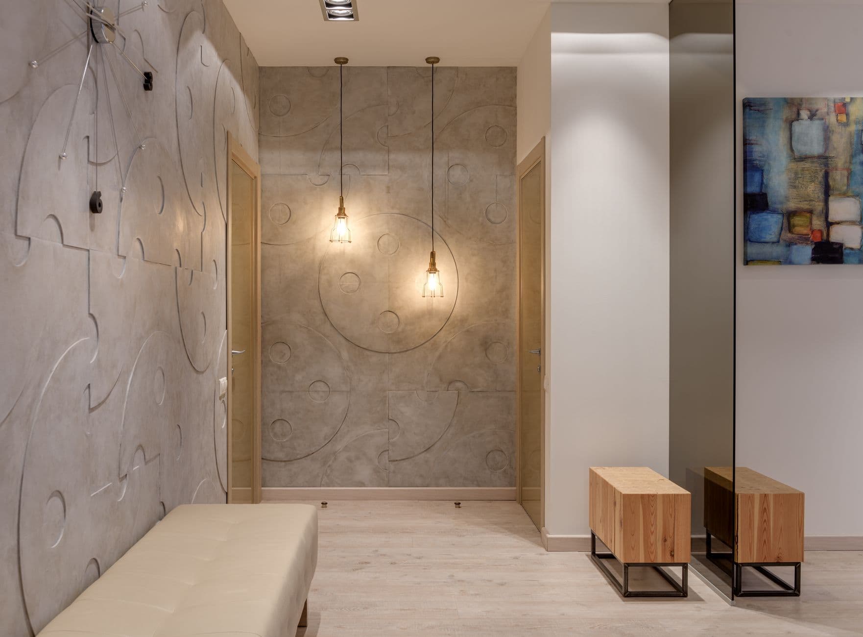
This narrow Copenhagen hallway holds exactly one piece of furniture: an oak bench spanning the full width of the wall, built like a deep shelf at sitting height. Shoes live beneath it in two low baskets, and the surface stays clear enough to drop a bag and sit to lace a boot. Because it runs wall to wall, it reads as architecture rather than furniture, and the hallway looks wider for it.
A short bench floating mid-wall is clutter; the full span is a line of calm. The height is the detail that makes it work: at forty-five centimetres it serves a seated adult and a standing hand equally well. One cut list, one Saturday, and a hallway gets its spine.
Storage that pretends to be a wall
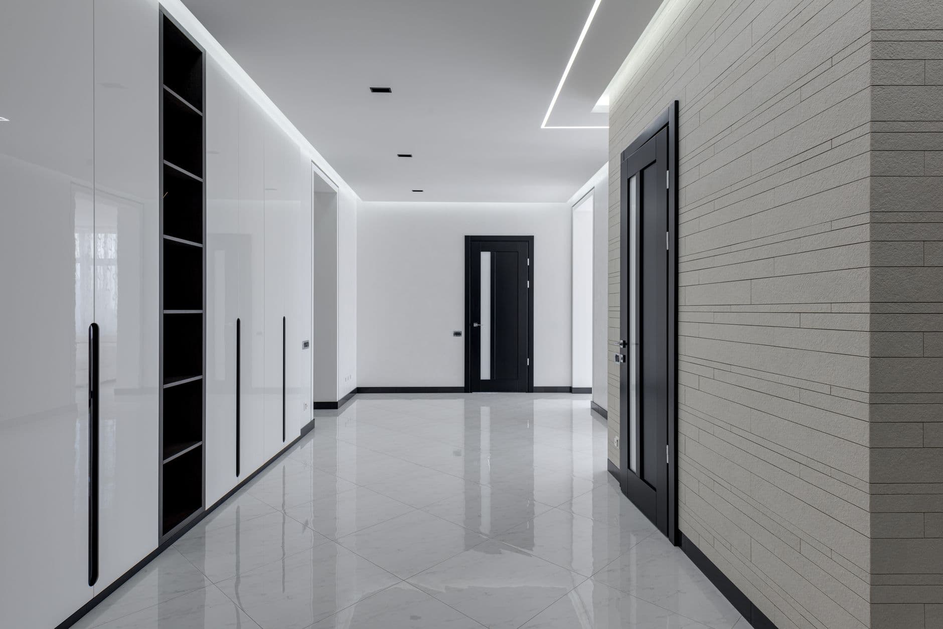
From the doorway this Antwerp entry looks like a panelled oak wall and nothing more. Press one panel and it opens to coats; press another, shoe shelves; a third hides the vacuum, the folding stool, the whole practical life of a household. Floor-to-ceiling, handle-free, grain matched across the doors, it swallows more than a walk-in closet while presenting the visual weight of a single warm surface.
Run cabinetry to the ceiling and it becomes wall; stop at head height and it stays a cupboard with a dusty top. This is the most expensive move in this list and the one I would save for longest, because a hallway that hides everything asks nothing of your discipline. Mine asks daily, and loses.
One mirror, placed for light instead of vanity
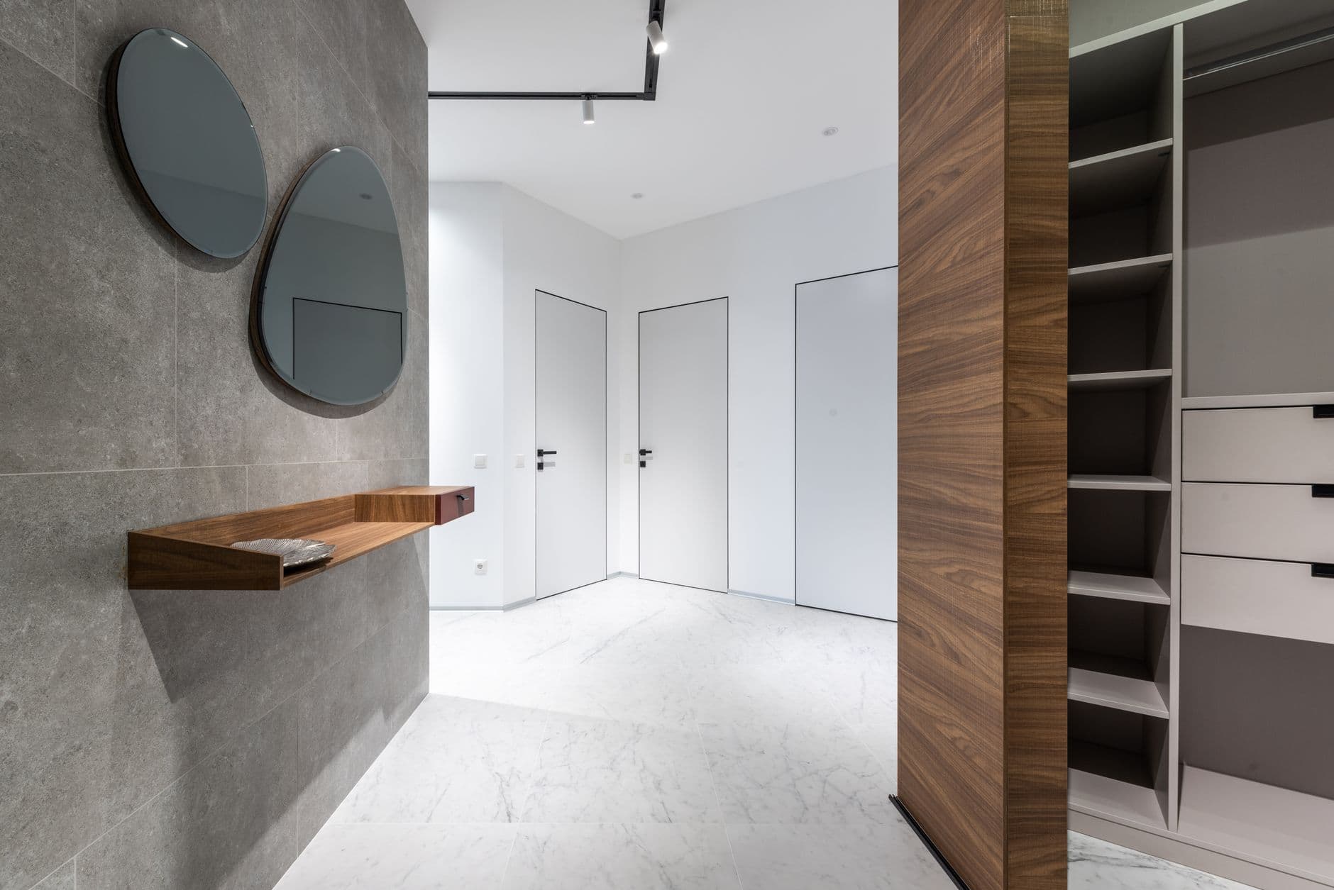
In a Paris apartment with a windowless entry, a generous round mirror hangs opposite the living room doorway, and the hallway borrows daylight it does not own. The glow moves across the wall through the day, doubling the sense of depth in a space barely a metre wide. There is a slim shelf beneath it for keys, and nothing else.
Aim the mirror at the light, not at the door. Hung opposite the front door it reflects whoever enters, which startles more than it welcomes; angled to catch the brightest adjacent room, it works as a lamp that never switches off. The old trick was a mirror to make the space look bigger. The current one is a mirror aimed like a window.
A floor that announces the house
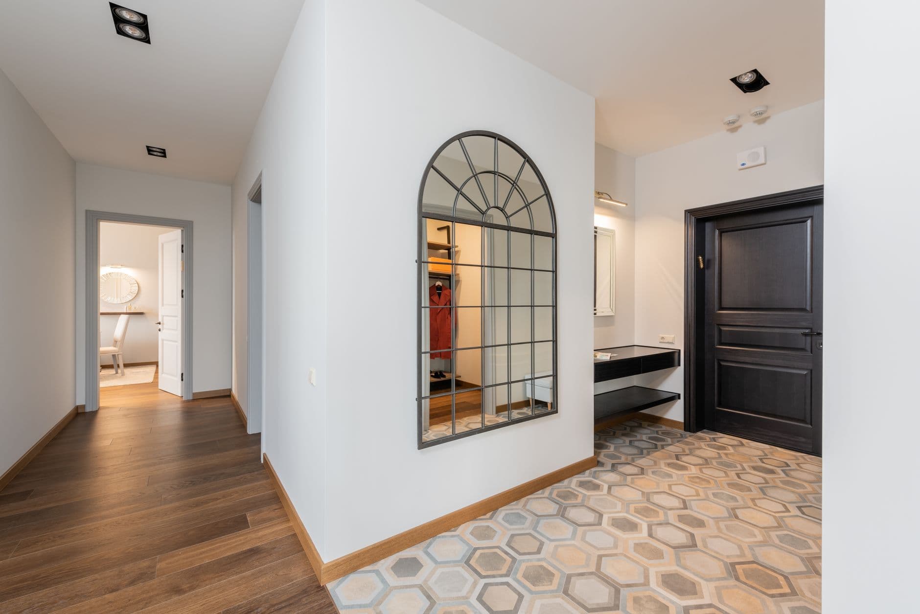
This Lisbon entry commits its personality to the ground: handmade terracotta tiles in a soft checkerboard with unbleached limestone, laid only in the entry zone before the oak floor of the living space takes over. The pattern says something is beginning here, and the material shrugs off wet shoes, grit and dog paws better than any wood could.
The restraint of the border makes it work: the tile stops in a clean straight line where the hallway ends. It reads as a deliberate room within the home rather than a leftover from a previous renovation. If your entry floor must be replaced anyway, this is where a modest budget buys the most character per square metre.
The drop zone with a closing lid
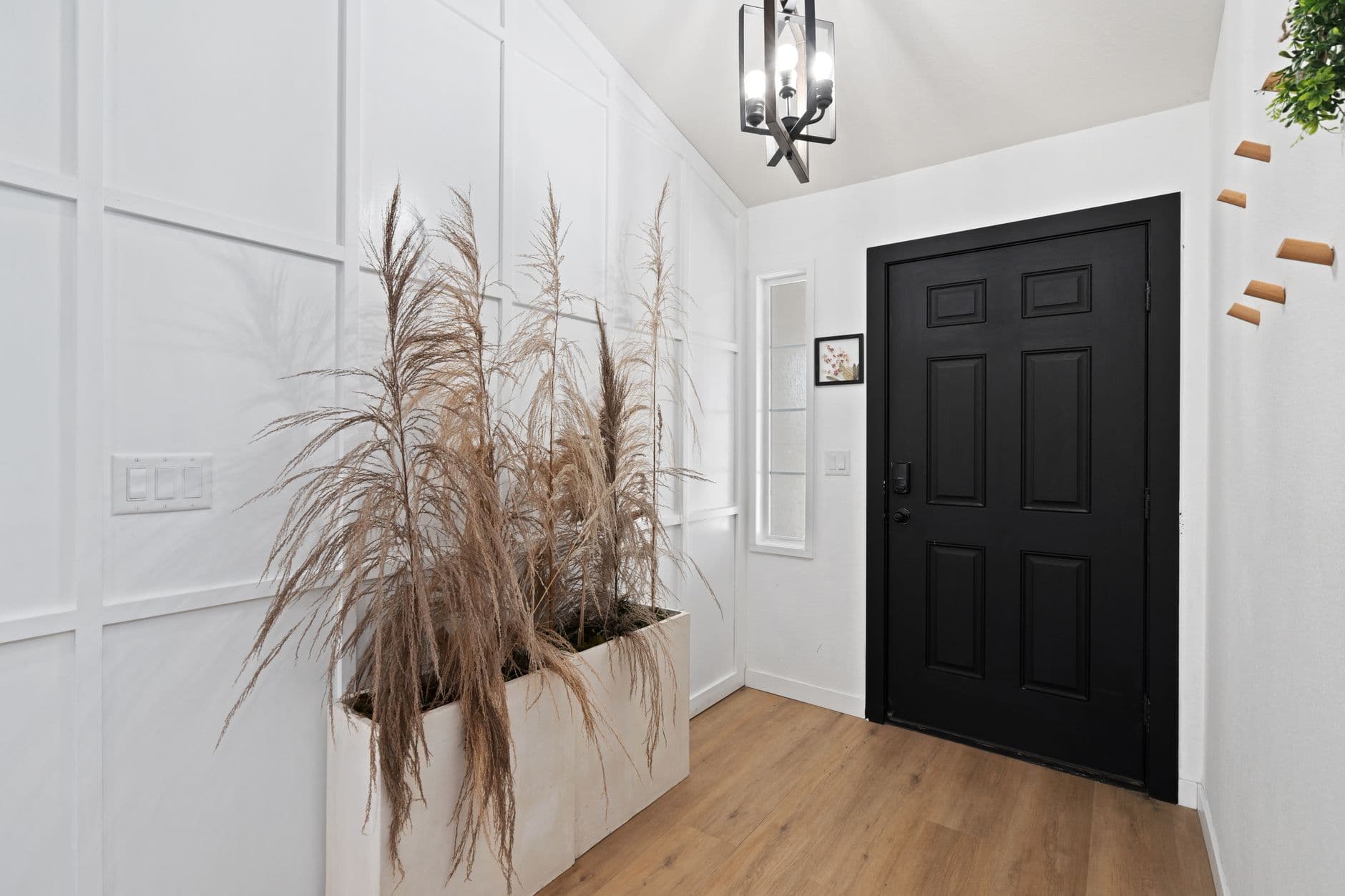
The most-used object in this Berlin hallway is a plain oak box on the console, the size of two shoeboxes, with a heavy lid. Post goes in, keys go in, the bike lock, sunglasses, the pocket contents of an entire family, and at the weekend the box is emptied in one pass. The console around it stays bare, and so does the mind on the way out the door.
An open tray displays clutter and asks to be tidied daily; a closed box makes the mess disappear the moment it lands. It is the cheapest idea in this list and the one I copied first, because it solves the actual problem of an entryway, which was never decoration. It was always the stuff.
A dark hallway that stopped apologising
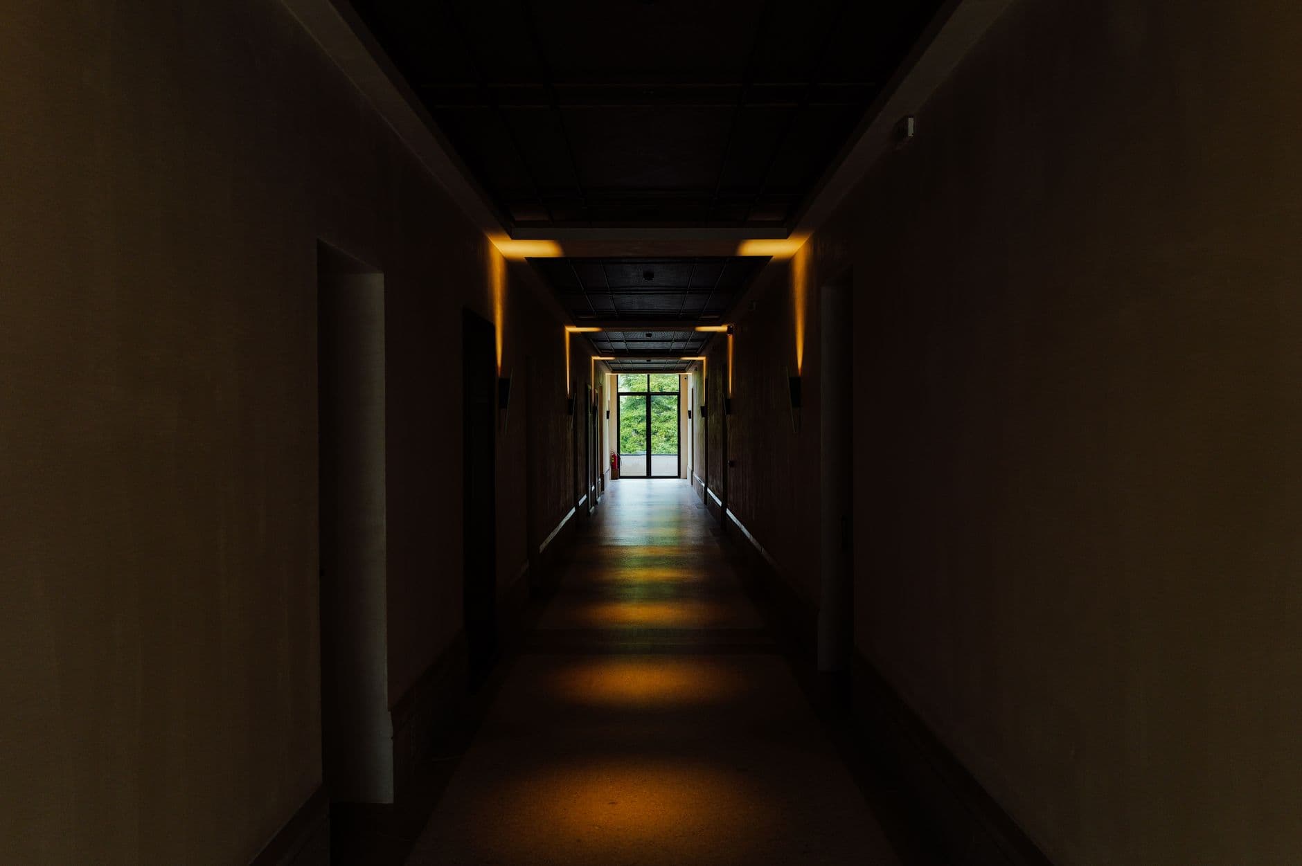
The final entry, in Amsterdam, breaks the oldest rule of them all: it is painted deep bronze green, walls, trim, ceiling, radiator and even the inside of the front door, in one continuous colour. Compressed and windowless, it should feel like a cave, and instead it feels like a held breath. Every room beyond it appears brighter and taller by contrast.
One wall in a dark shade reads as unfinished courage; the whole envelope in one colour reads as conviction. Hooks in aged brass and a single warm wall light finish it. I wrote a full guide to this move in colour drenching, done the calm way. Twelve years ago this hallway would have been painted white in a fight it could not win. It stopped fighting, and won.
If your hallway fails the daily test the way mine did: buy the lidded box this week, plan the bench for next month, and save the panelled wall for the year the budget allows it.