Colour Drenching, Done the Calm Way
Painting walls, trim and ceiling in one colour is the trend that actually earns its keep. Here is how to drench a room without losing the calm.
Written by Vestados Editorial · 25 August 2026
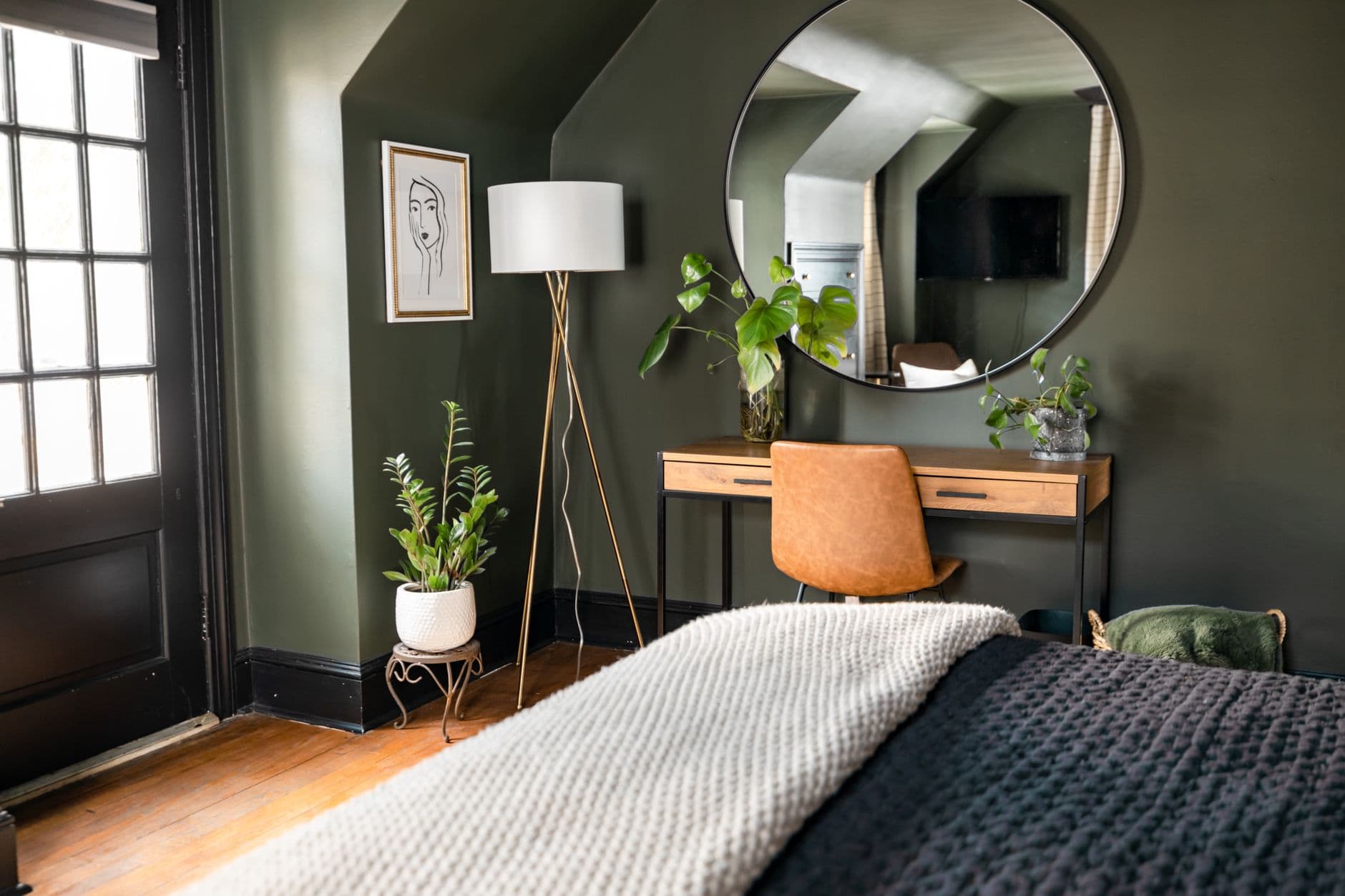
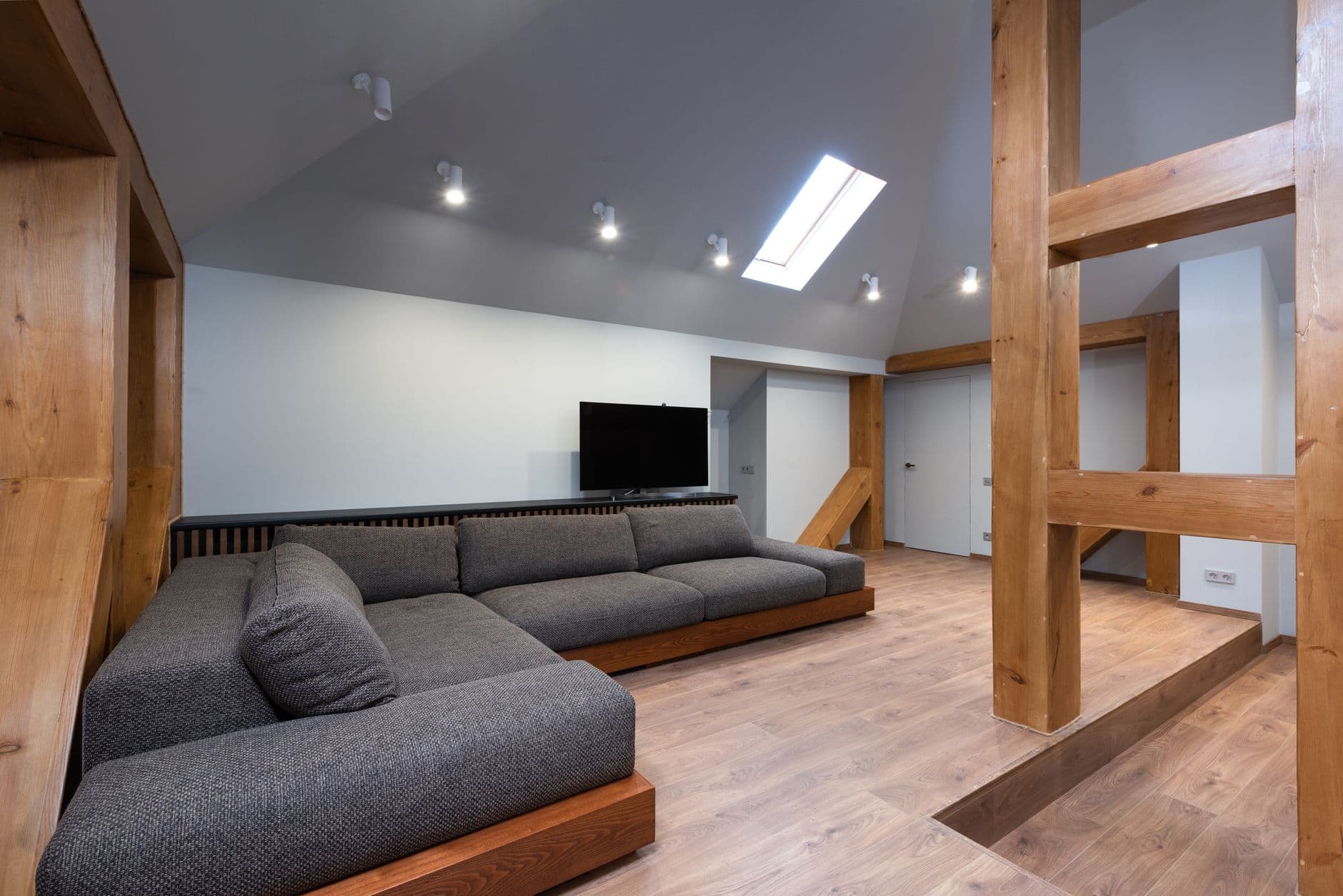
Most paint trends ask you to add something. Colour drenching asks you to stop. One colour goes on the walls, the trim, the skirting, sometimes the ceiling and the radiator too, and the room suddenly reads as a single continuous space instead of a collection of edges.
I resisted this trend for a full year because the examples I kept seeing were loud: teal libraries, oxblood snugs, rooms that felt like a statement you had to live up to. Then I drenched the smallest, darkest room in my own home in a muddy olive, and I understood. Done with a warm, murky shade it removes visual noise rather than adding it, which is exactly what warm minimalism wants. Here is how I would choose the shade, where it works hardest, and how to keep the result quiet.
Why one colour reads as calm, not loud
White trim exists to draw lines: around doors, along skirting, at the ceiling edge. Every one of those lines tells your eye where a surface stops, and a small room full of stops feels smaller. Paint the lot in one colour and the lines dissolve. Walls flow into woodwork, the ceiling stops announcing its height, and the furniture becomes the thing you actually look at.
The colour is doing structural work, not decorative work. You are not choosing a feature wall that performs; you are choosing an envelope that recedes. That is why a drenched room in a deep shade can feel bigger than the same room in white with bright trim. Once I started seeing it that way, the shade I picked mattered far more than the courage it took.
Choose a muddy shade, not a bright one

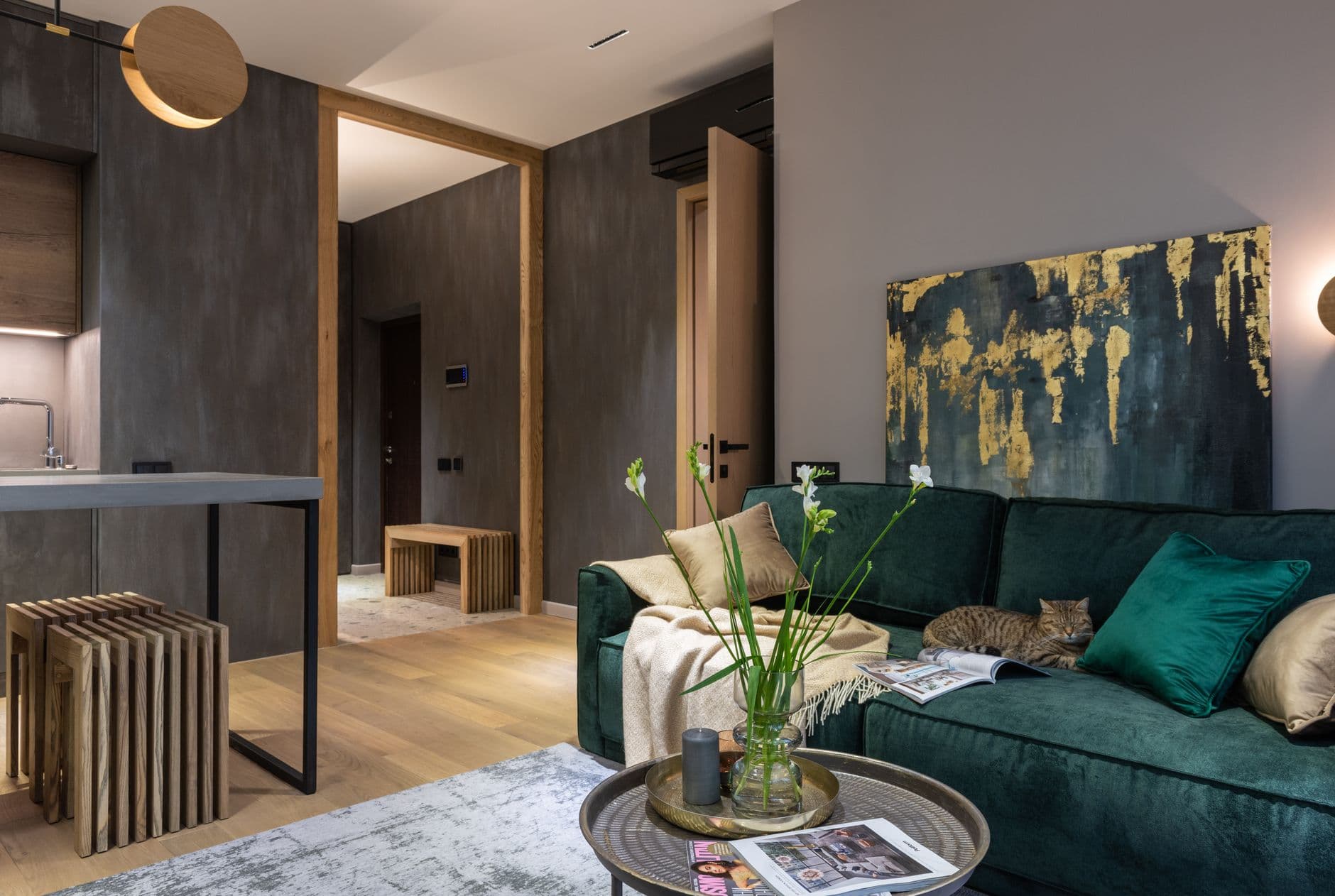
The colours that drench well have grey or brown mixed in: sage, olive, clay, oxblood, deep bronze green, warm putty. A clean, saturated colour on every surface bounces against itself and gets louder as the day goes on. A muddied shade absorbs its own reflections and settles down.
If a swatch still charms you at nine in the evening under a lamp, it will survive the whole room. Test it the honest way: paint two large sample boards, stand one against the wall and hold one overhead where the ceiling would be, and live with them through a morning and an evening. Ceilings receive less light than walls, so the same paint reads a step darker up there, which is exactly what makes the room feel enveloping rather than boxed in.
Start where you pass through, not where you sit
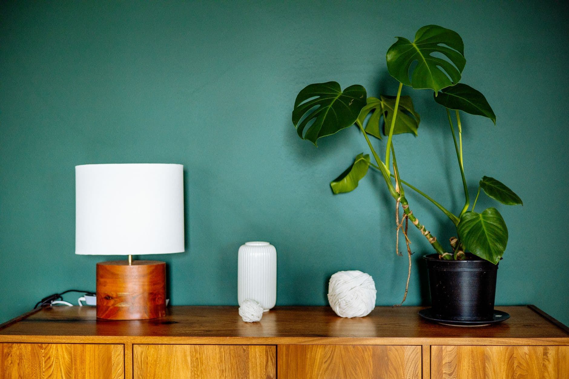
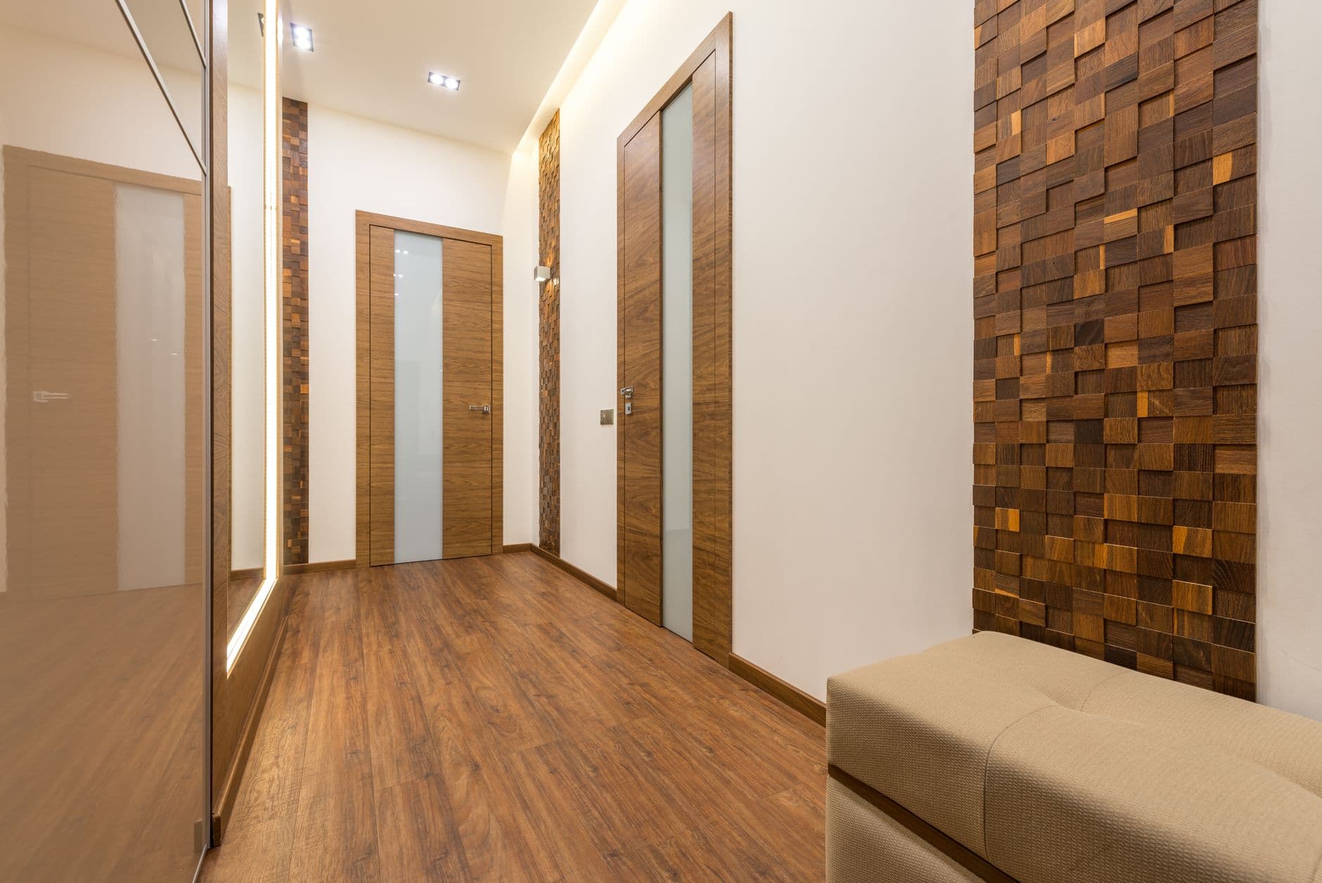
The lowest-risk room to drench is the one you move through rather than live in: the hallway, the loo, the landing. These spaces are usually short on daylight and long on awkward angles, doors and trim, which is precisely the clutter that one colour erases. A hallway drenched in deep olive or aubergine stops being a corridor of doorframes and becomes a moment of compression that makes the rooms beyond feel brighter and taller.
The old advice, retired
Twelve years ago every styling guide said the same thing: paint small dark spaces white to fight the gloom. I followed that advice in two homes and the hallways stayed gloomy, just paler about it. You do not fight a dark hallway, you commit to it, and the contrast does the flattering work for every room it touches.
The bedroom is where drenching earns its keep
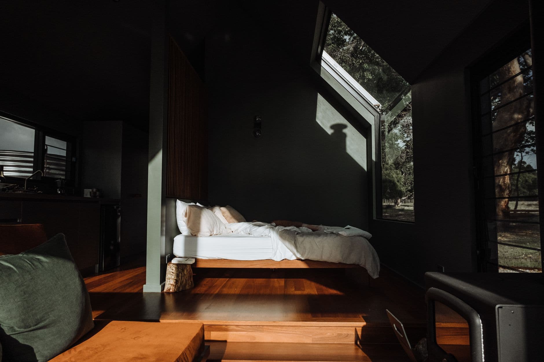
Bedrooms want enclosure. A drenched bedroom in a warm, deep shade lowers the perceived ceiling just enough to feel sheltering, and because there are no contrast lines, nothing pulls your eye while you are trying to wind down. Keep the bedding in unbleached linen or soft white so the bed reads as the light source of the room, then let timber, cane or a wool throw carry the texture.
The whole room is the feature, quietly. The headboard wall no longer needs to perform. If a full ceiling feels like a leap, drench to the picture rail line and paint above it in a softened, lighter version of the same colour rather than white, so the transition whispers instead of snaps.
Let texture do what contrast used to do
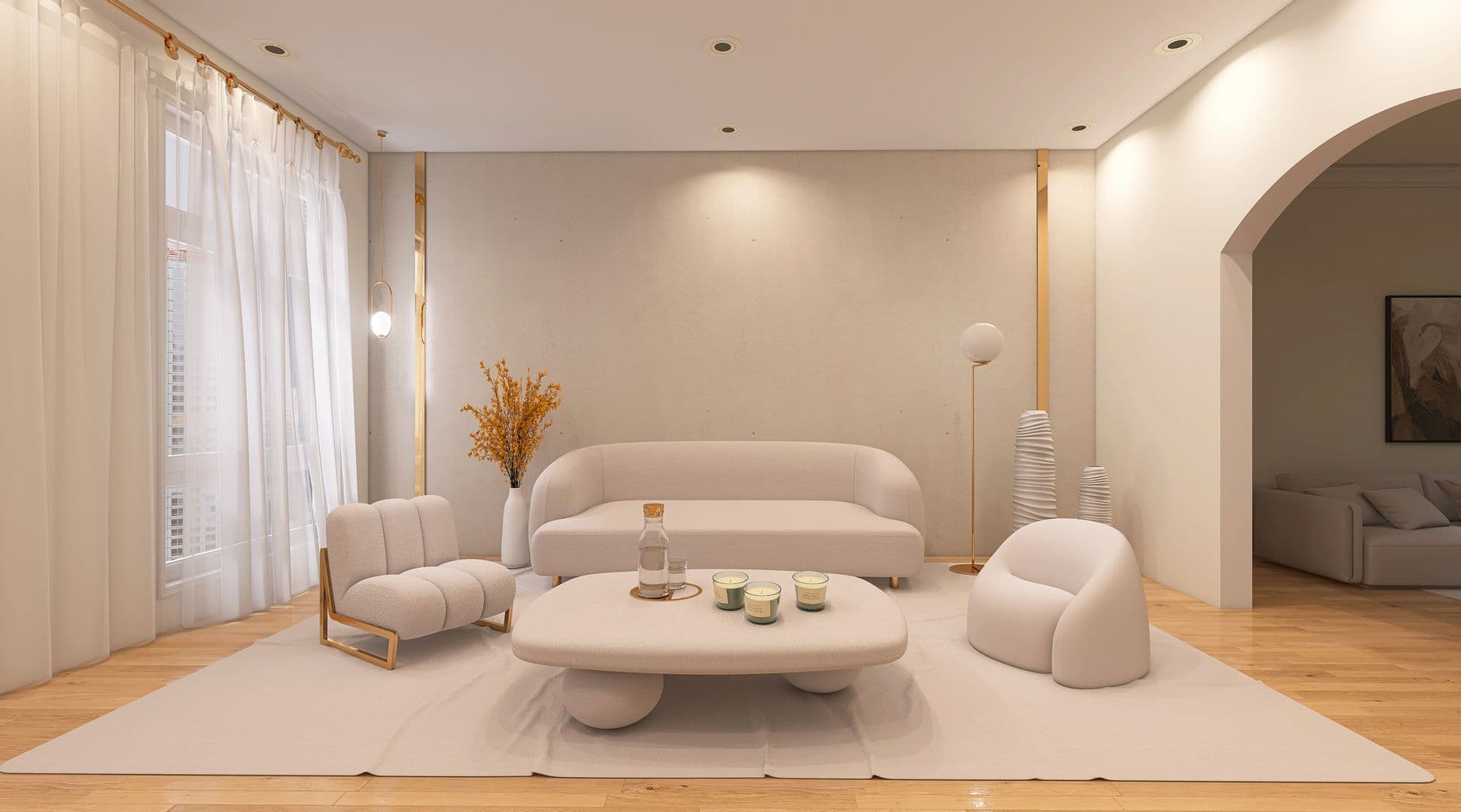
Strip the colour contrast out of a room and you need something else to keep it alive. That something is texture. In a drenched room a limewashed wall catches light differently through the day, a boucle chair reads sculptural against the flat colour, and oak or rattan suddenly look richer because nothing competes with their grain.
Add three textures deliberately: something woven, something wooden, something soft. That is the whole formula. Choose matt or eggshell for walls and trim rather than gloss, which throws reflections and reintroduces the edges you just removed. The room stays minimal in colour and generous in feel.
Where to stop before it becomes a theme
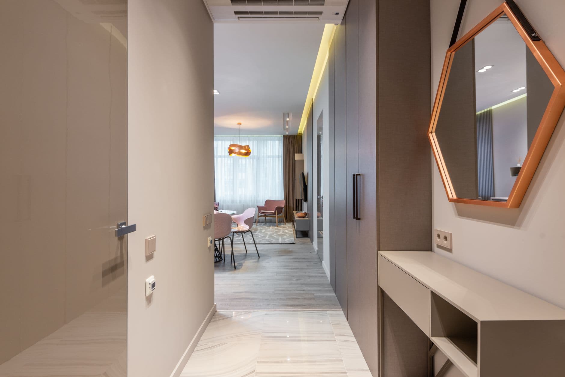
One drenched room in a home is a considered move. Four begin to feel like a bit. I would let the drenched space be the deep breath in the floor plan and keep the adjoining rooms in warm whites and naturals, the way I described in my warm neutral palette guide, so the contrast stays meaningful.
The room is already coherent; resist the matching accessories. No cushion in the exact wall colour, no artwork chosen to tone in. A little friction from a chair in another material or a frame in aged brass keeps it from reading like a paint advert. And if you rent or you are cautious, drench the smallest room first and live with it for a season, exactly the way I did.
If I were starting today: buy two sample pots of a muddy green and a warm clay, paint the boards, and tape them up in the hallway tonight. The rest follows from what you feel at 9 pm.