How to Build a Warm Neutral Palette That Actually Works
Warm neutrals look effortless and go wrong constantly. Here is how to choose the right whites, work in close tones, and let wood and light do the heavy lifting.
Warm neutral rooms are the ones that make you exhale when you walk in. They look simple, almost like nothing was decided, and that is exactly why they are so easy to get wrong. Reach for the wrong white and the whole room turns grey and clinical. Pile on too many colours and it goes muddy. The good news is that a warm neutral scheme runs on a handful of rules, not on luck or a big budget. Get the whites right, keep your tones close together, treat wood as a real colour, and let light make the final call. Here is how to build it so it holds together in every room and every hour of the day.
Start with warm whites, not cool ones
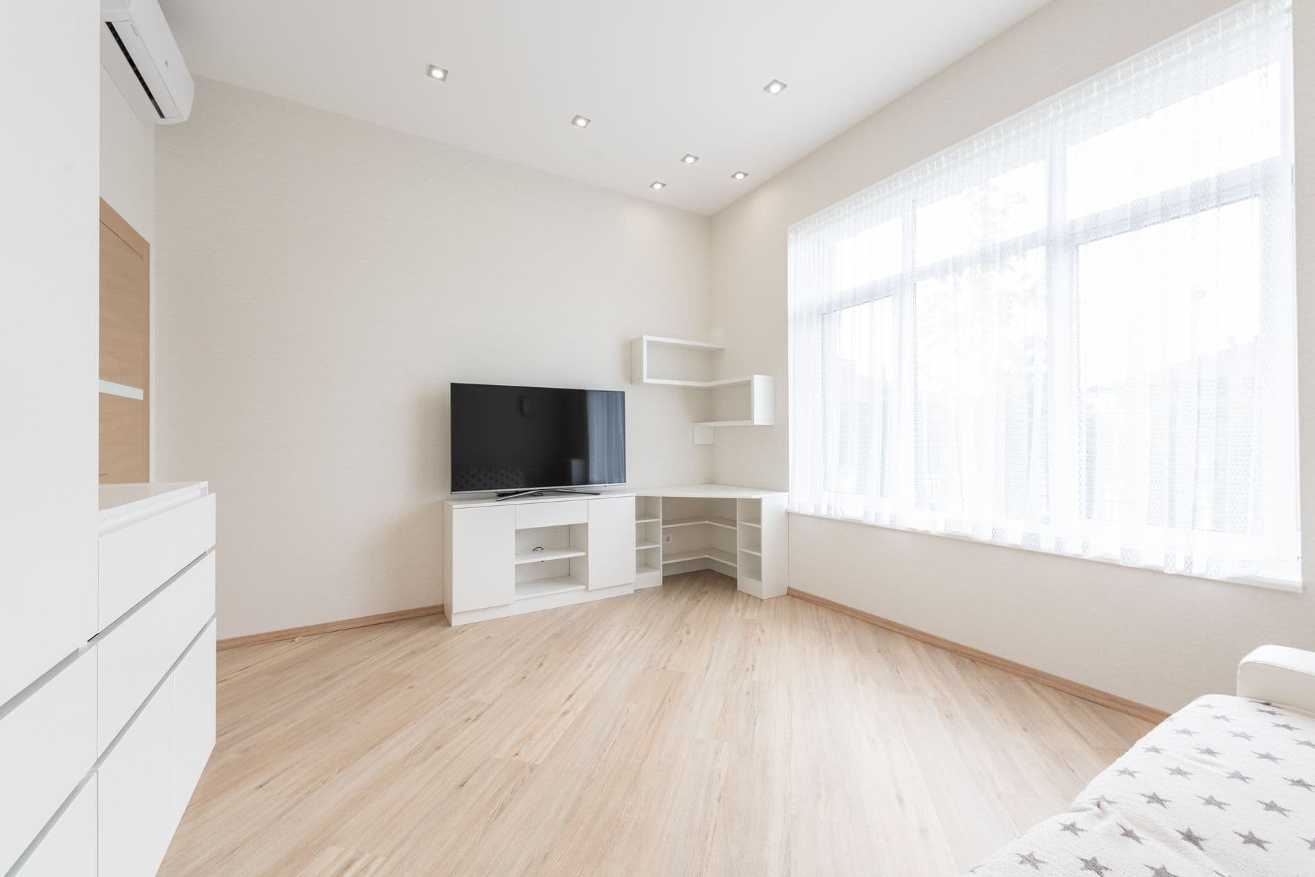
The single biggest decision is your white, because it sets the temperature for everything else. Cool whites lean blue or grey and read crisp on a phone screen, but in a real room with real light they can feel flat and a little cold. Warm whites carry a faint yellow, cream, or putty undertone that reads as soft rather than stark. Hold a few swatches against your existing wood and fabric before you commit. If a white makes your oak look orange or your linen look dingy, it is fighting the room. You want a white that disappears quietly and lets the textures speak. When in doubt, go a touch warmer than feels obvious, because daylight will cool it down anyway.
Work in three or four close tones
A warm neutral palette is not one colour, it is a small family of them sitting close together. Pick a warm white, a soft oatmeal or greige, a deeper putty or mushroom, and maybe one clay note, and let them repeat around the room. The trick is keeping them near each other on the scale so the shifts feel gentle rather than jumpy. Think of it as one colour breathing in and out. Too much distance between tones and the room starts to look striped and busy. Too little and it goes flat. Three or four steps is the sweet spot: enough to give depth and shadow, calm enough that nothing shouts. Once you have the family, use it everywhere, from walls to cushions to throws.
Let wood act as a colour
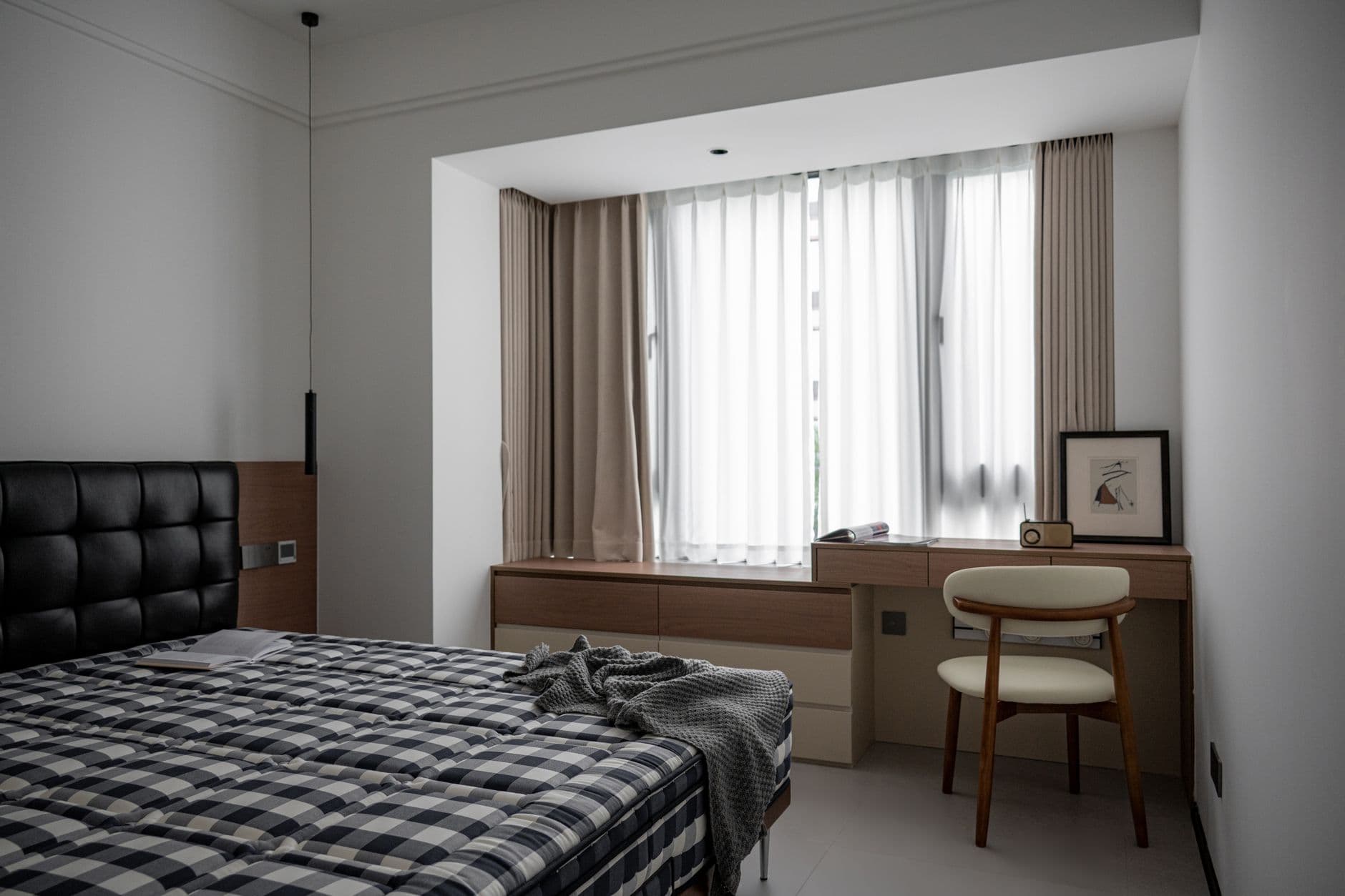
People treat wood as a neutral background, but in a warm palette it is one of your main colours, so choose it on purpose. Pale oak brings honey and gold and keeps a room feeling light and open. Walnut goes deeper and warmer and grounds a space with a chocolate undertone. Whatever you pick, repeat it, because one lonely wood tone reads as an accident while two or three echoes of it read as a scheme. A floor, a table, and a shelf in related tones will do more for warmth than any amount of beige paint. Watch the undertone too: some oaks pull slightly pink or grey, and you want them singing with your whites, not clashing against them.
Ground the scheme with one darker note
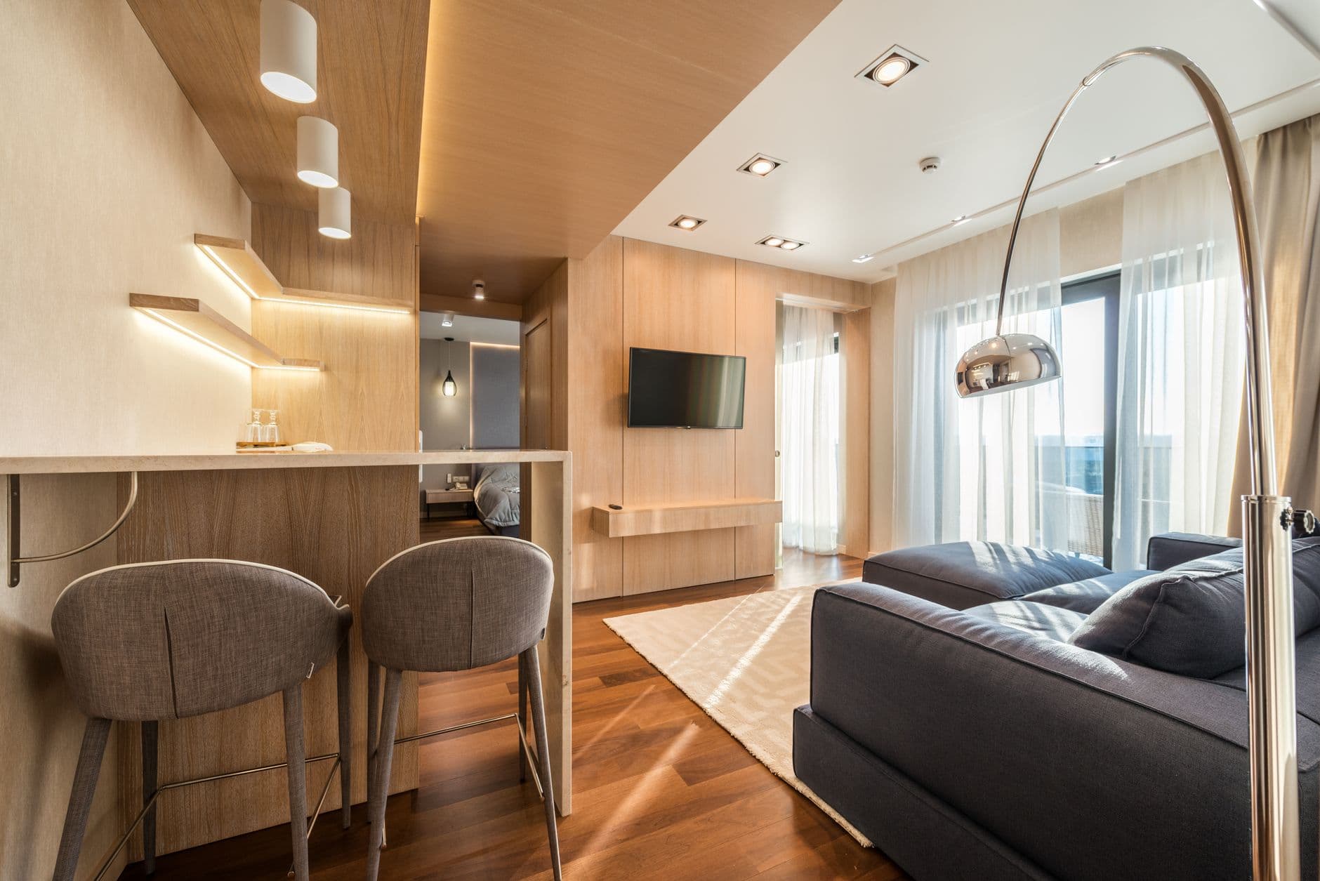
An all-light room can drift into looking washed out, like a photo that is slightly overexposed. One darker note fixes it instantly and gives your eye somewhere to land. This does not mean a bold accent colour. It means a single deeper anchor that still belongs to the warm family: a soft black frame, a bronze lamp, a charcoal-brown chair, an espresso stool. Keep it to one or two moments so it grounds the room without breaking the calm. The contrast should feel like a shadow, not a spotlight. That small weight of dark is what makes all the pale tones around it read as intentional and quietly expensive rather than simply empty.
Use texture instead of contrast
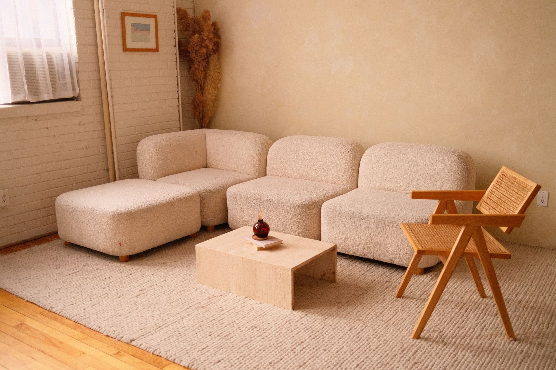
When your colours sit close together, texture becomes the thing that stops a room going flat. This is where warm minimalism earns its keep. A nubby linen sofa, a chunky wool throw, a boucle chair, a raw plaster wall, a jute rug: all of them can be nearly the same tone yet feel rich because the surfaces catch light differently. Mix rough against smooth and matte against soft sheen. A polished stone top next to woven baskets. Crisp cotton against heavy knit. You are building interest through how things feel rather than how loudly they contrast. Done well, a room that is technically almost one colour ends up looking layered, tactile, and warm enough to want to sit in.
Test every tone in real light
A colour is only ever half paint and half light, so never trust a swatch under a shop bulb or a screen. Tape your samples up on more than one wall and live with them for a couple of days. North light is cooler and flattens warmth, so lean warmer to compensate. South light is generous and can push warm tones toward yellow, so ease off. Check them in the morning, in the flat grey of midday, and under your lamps at night, because a white that looks perfect at noon can turn peachy or dull by evening. The room decides, not the paint chart. A little patience here saves you repainting later and is the difference between a palette that works and one that only worked in the tin.