Statement lighting over the dining table: how to get the height, spacing and fixture right
The light above the table sets the mood of the whole room before anyone sits down. Here is how high to hang it, how many pendants a long table wants, and which move suits your table.
The light above a dining table makes a decision about the whole room before anyone sits down. Get it wrong and a good table looks like a showroom offcut. Get it right and the same table feels like the reason the room exists. Most of it comes down to a few numbers and one clear choice: how high you hang the fixture, how many you use, and which shape suits your table. Here is how to make each move, with the one detail that makes it work.
Start with the height: 75 to 90 cm above the table
Height is the mistake people make most, and it is the easiest to fix. Aim for the bottom of the fixture to sit around 75 to 90 centimetres above the tabletop. That is high enough to see the person across from you and low enough that the light feels like a roof over the meal rather than a lamp lost near the ceiling. In a room with tall ceilings, nudge it up a little so the proportions stay honest, but do not chase the ceiling. The light belongs to the table, not the room. Sit down first, then judge the drop from a chair, because that is where you will actually experience it.
For a long rectangular table, run one linear suspension down the centre
A rectangular table wants a light with the same geometry. A single long linear suspension, run parallel to the tabletop, draws one clean line down the middle and lets everything underneath it stay calm. It reads as one decision instead of a row of little ones, which is exactly why it looks considered. Centre it on the length of the table and keep it a touch shorter than the tabletop so the ends breathe. This is the quietest way to light a long table, and quiet is the whole point. One line, one gesture, nothing fighting it near the ceiling.
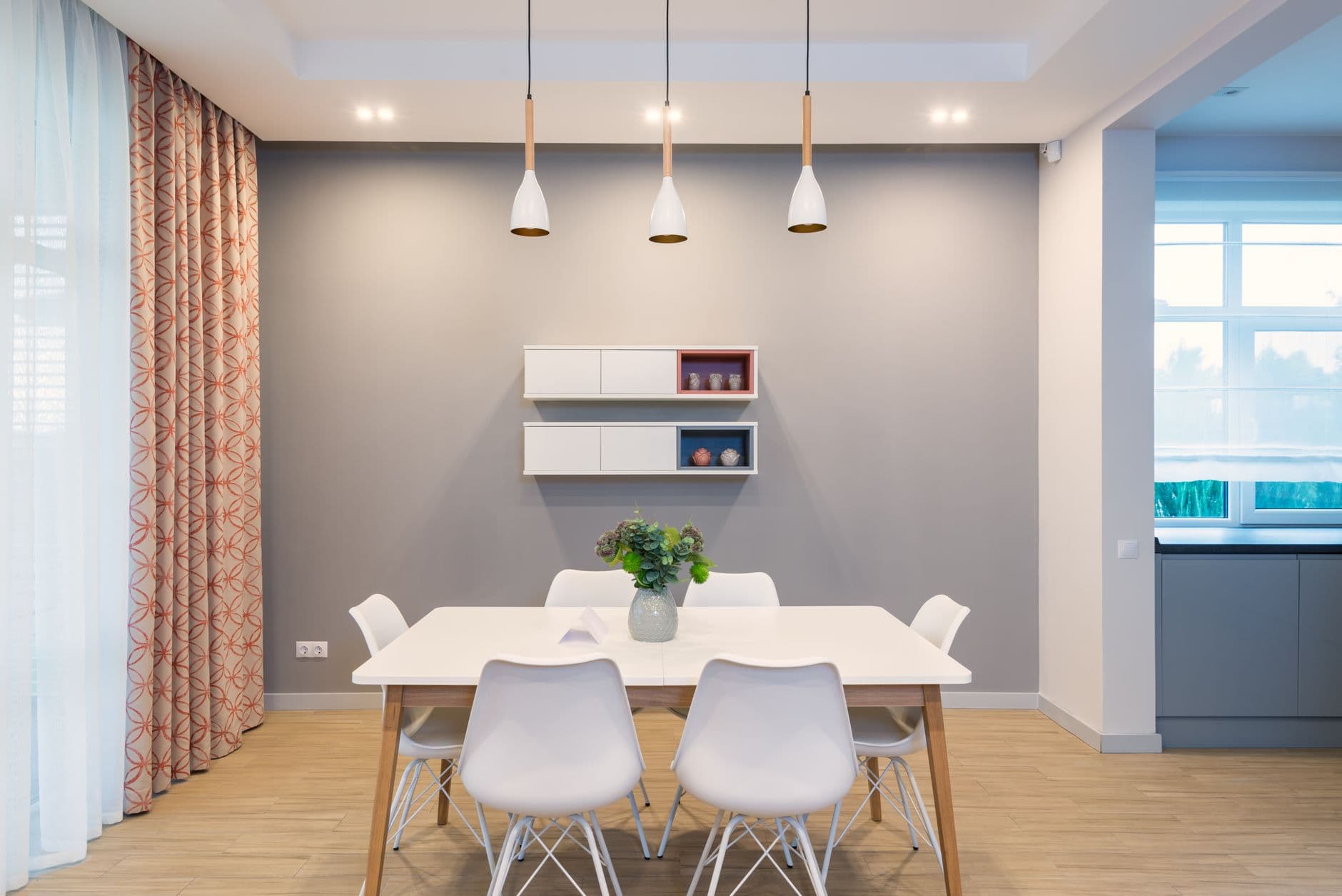
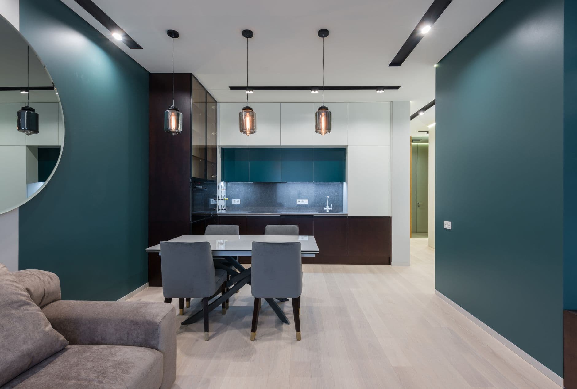
For a round or square table, cluster three to five small pendants
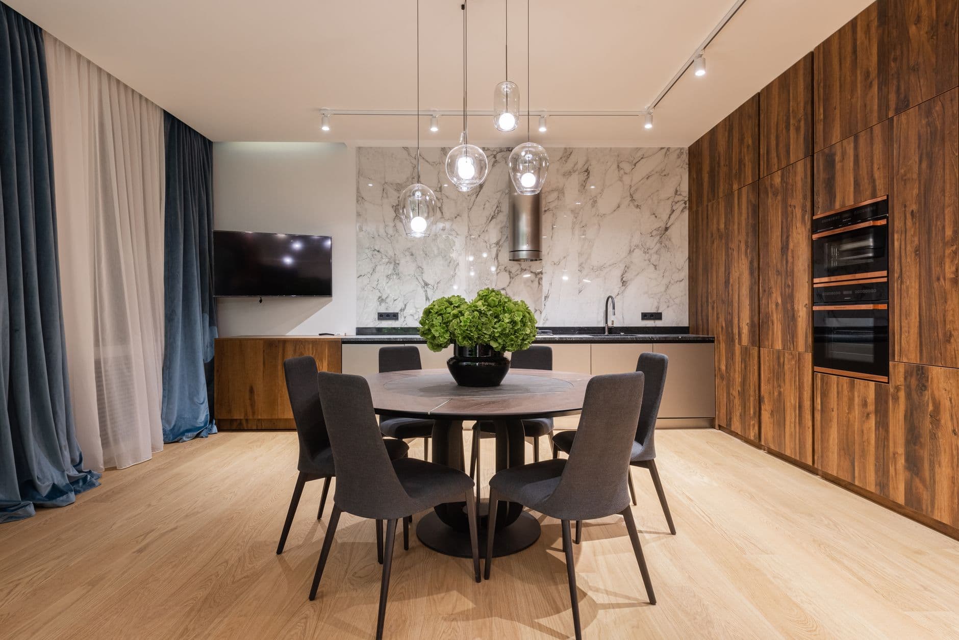
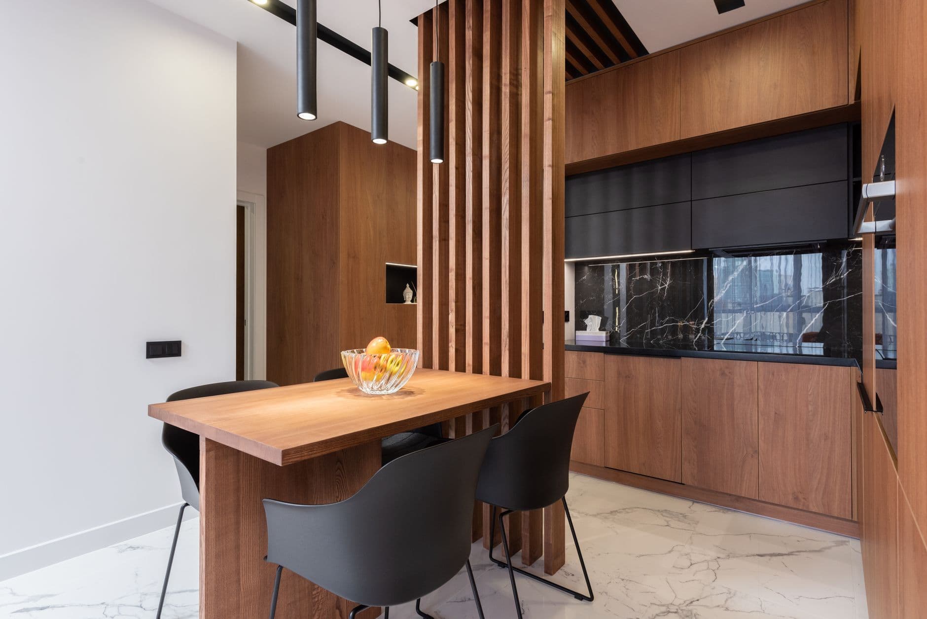
A round or square table gives a single line nothing to follow, so cluster instead. Three to five small pendants hung at staggered heights give you movement without clutter, and the gaps between them matter as much as the shades themselves. The trick is restraint: use odd numbers, vary the drops, and keep one finish across all of them so the group reads as one idea. Keep the whole cluster inside the footprint of the table so nobody stands up into it. This is the arrangement people ask about most, and it fails only when every pendant hangs at the same height, which turns a cluster into a grid.
In a tall room, let one oversized shade do everything
When a room has height to spare, one oversized sculptural shade is braver than a chandelier and usually simpler. A single big form in paper, plaster or ribbed glass fills the vertical space and makes a modest table feel deliberate. The rule is one gesture and nothing else competing near the ceiling. If you catch yourself adding a second feature above eye level, take it out. The strength of this move is that the fixture becomes the object in the room, so it has to earn that job. Pick a shape you would keep even if the light were switched off, because half the time it will be.
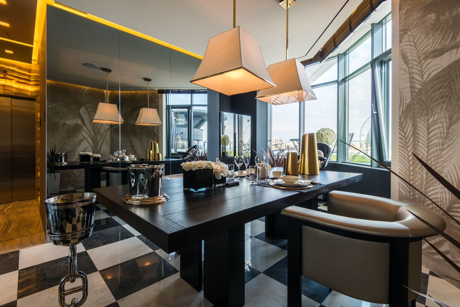
If you want two pendants, divide the table into thirds
On a long table, two identical pendants often beat one fixture stretched too thin. Symmetry does the heavy lifting here, and the spacing is the whole trick: divide the length of the table into thirds and hang one pendant over each of the two inner points. Matching shades keep it calm, and the even spacing is what makes a big table feel planned rather than filled. This is the safest of the moves and still looks intentional, which is why it turns up in so many rooms that get it right. Two lights, evenly placed, reading as a pair instead of two separate decisions.
Choose brass in its warm, brushed form, not the shiny one
Brass gets a bad name from the shiny lacquered version. The finish to look for is brushed or aged, closer to honey than to gold, so it warms a room instead of shouting in it. Over a wood table with a linen runner nearby, warm metal pulls the whole palette together and makes the light feel like it belongs to the house. Skip anything mirror bright, because that is the finish that dates fastest. The matte and brushed tones are the ones that still look right in ten years. Restraint is the rule with warm metal: one warm finish in the fixture, echoed lightly elsewhere, and nothing trying to match it exactly.