Kitchens worth studying: six modern European rooms and the one move each gets right
A good kitchen usually comes down to one decision made well. Here are six modern European rooms, and the single move that carries each of them.
A kitchen shows its hand quickly. You can tell within seconds whether someone made a few good decisions or a hundred small ones. The rooms below are not the busiest or the most expensive. They are the ones that commit to a single idea and let it carry everything else. Six kitchens, and the one move that makes each of them work.
One run of stone, all the way across
Most kitchens break the worktop into zones: prep here, sink there, a different material behind the hob. This one refuses. A single slab of pale stone runs the length of the counter, folds down the side of the island, and climbs the wall behind the cooktop as the splashback. The veining reads as one continuous line, so the eye never stops to count the joins. That is the whole move. When the surface is uninterrupted, the room feels quiet and deliberate, and everything you set on it, a board, a bowl, a kettle, looks placed rather than left. The lesson is restraint in materials, not in budget.
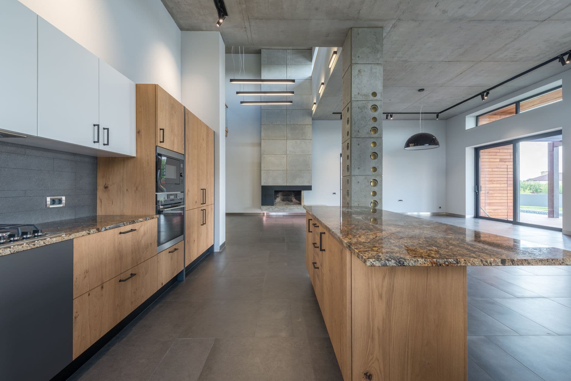
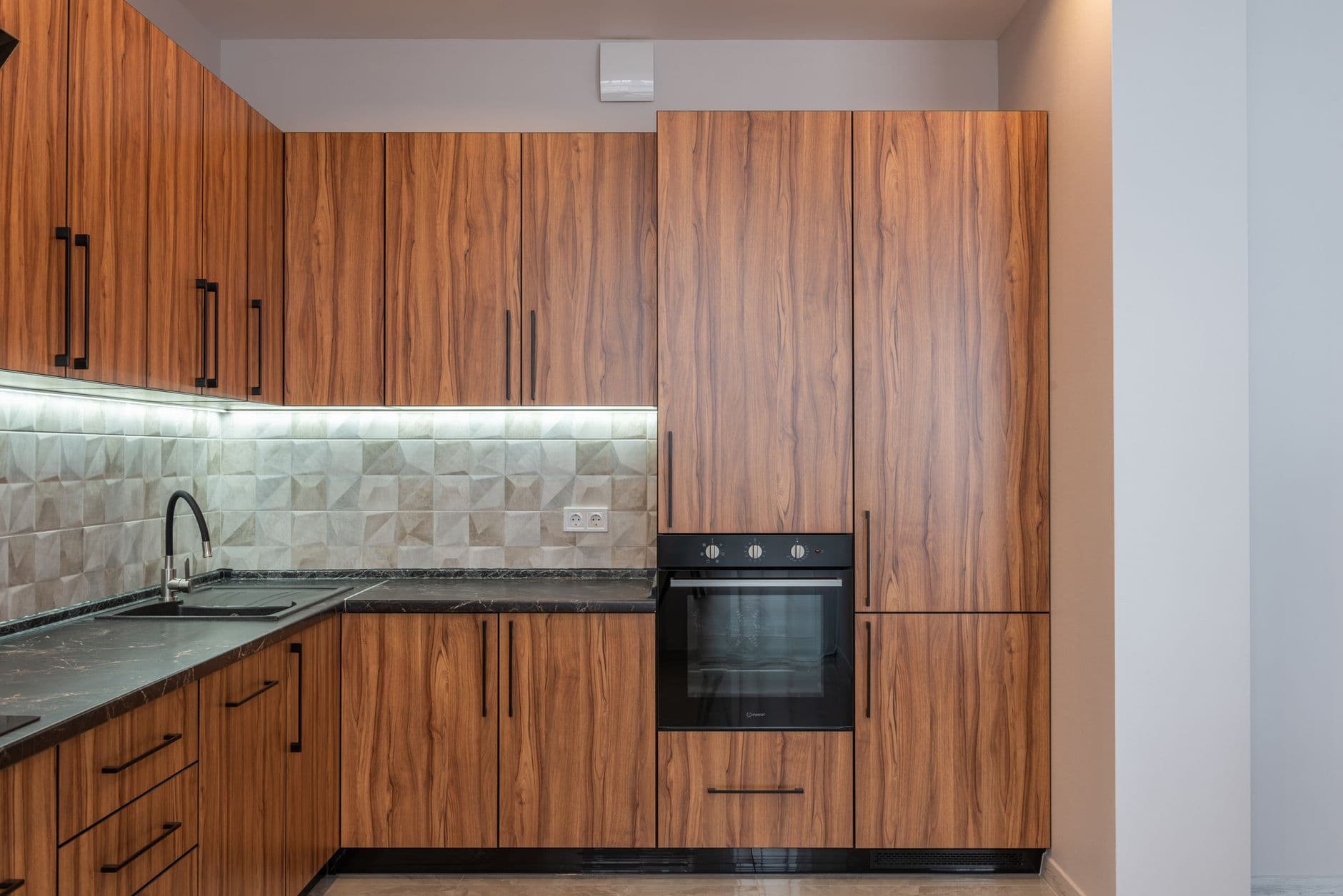
Warm oak doing the work of colour
White kitchens can drift toward cold, more gallery than home. Here the fix is oak, and only oak. The cabinet fronts are a warm, close-grained timber set against chalk-white walls and a matte stone floor, and that contrast does everything a wall of colour would, without the commitment. Notice how the grain runs vertically on the tall units and horizontally on the drawers, so the wood catches light differently as you move. It keeps a plain palette from going flat. The detail that makes it work is the finish: oiled, not lacquered, so the timber looks touchable instead of sealed under plastic. Warmth is a material choice here, not a paint chart.
The pantry you cannot see
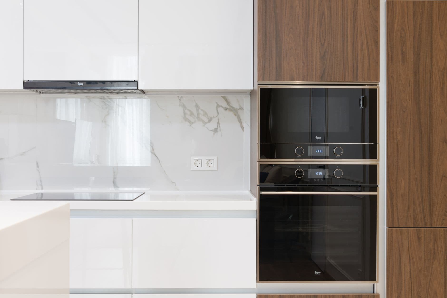
The best storage move in a modern kitchen is to hide that it is storage at all. This room reads as a calm wall of flat panels, floor to ceiling, no handles, no visible hinges. Then a section pushes open and a whole working pantry sits behind it: shelves, a second counter, the coffee setup, the clutter of an actual life. Closed, the wall gives you the clean architectural face everyone wants. Open, it gives you somewhere to be messy. The one thing that sells it is alignment. The concealed doors follow the exact same grid as the real cabinetry, so nothing telegraphs where the seam is until you reach for it.
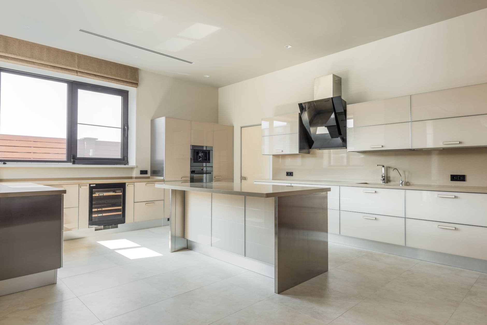
An island shaped like a sculpture
An island is usually a box with a top. This one is carved. A single block of stone sits in the middle of the room with a deep, chamfered edge and no visible base cabinets, so it looks quarried rather than assembled. Around it the perimeter stays low and plain, almost recessive, which is the point: one strong object needs a calm room to stand in. Put two sculptural pieces in a kitchen and they argue. The detail that holds it together is the overhang, generous enough to tuck a stool under and read as a solid mass from across the room. Give one element permission to be the star, and let the rest step back.
Brass, used almost sparingly
Metal finishes are where kitchens lose their nerve, chrome on the tap, black on the handles, steel on the hood, all fighting. This room picks brass and then barely uses it. A single unlacquered tap, the thin edge of a shelf bracket, the pulls on one run of drawers, and nothing else. Against warm timber and soft plaster the metal glows rather than gleams, and because it is left to age it will darken into the room instead of dating it. The move is discipline: one warm metal, repeated three or four times at most, then stopped. A kitchen reads as expensive when the finishes agree with each other, not when there are more of them.
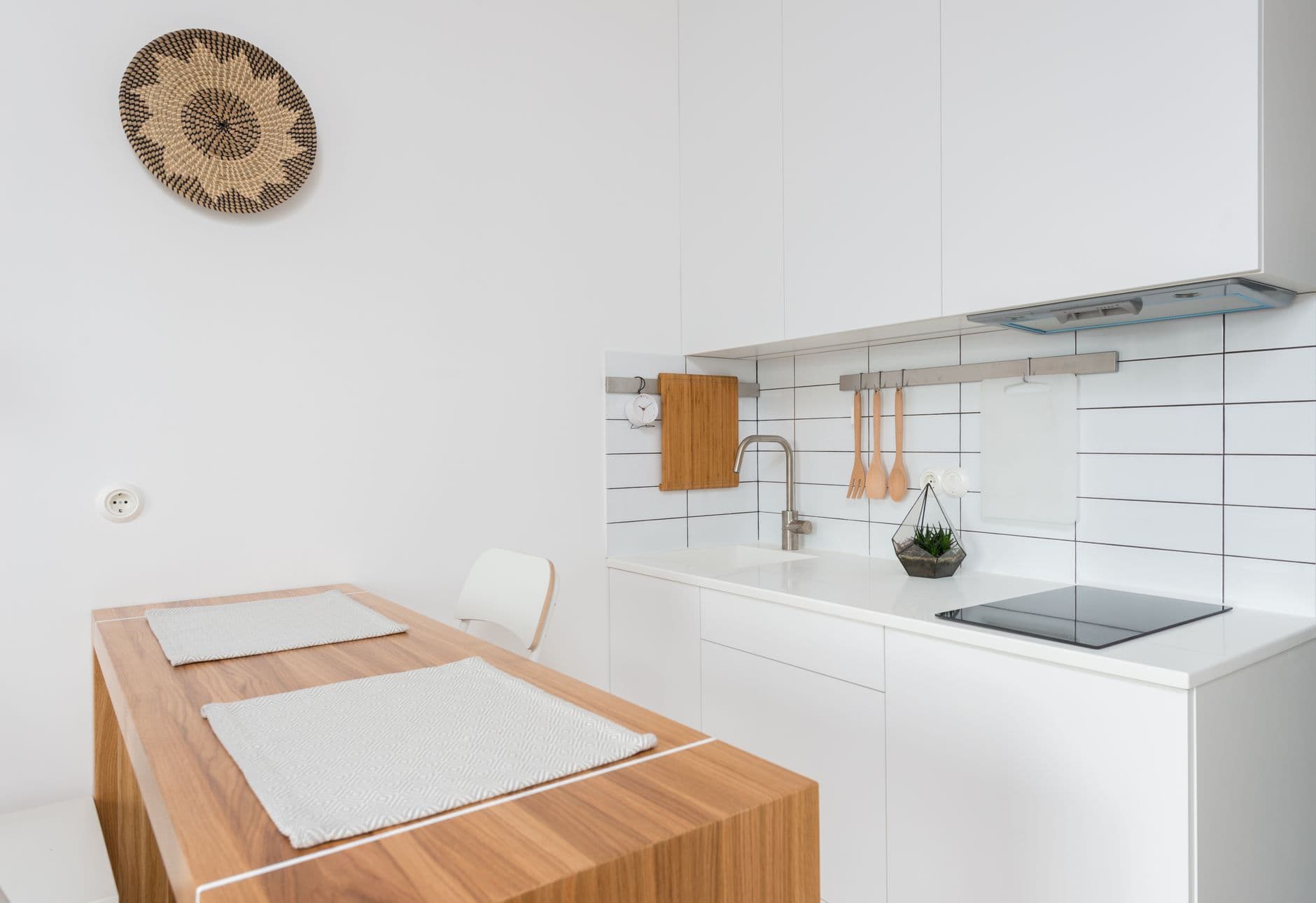
Letting the window be the backsplash
The wall behind the sink is prime real estate, and most kitchens fill it with tile. This one leaves it open. A long window runs the full width of the counter where the splashback would go, so instead of grout lines you get the garden, the light, the weather changing through the day. The counter stops in a neat stone upstand and the glass takes over from there. It is a calmer thing to stand in front of while you work. The detail that makes it practical is the deep stone sill, wide enough to catch splashes and hold a few plants, so the window earns its place rather than just looking good. Sometimes the best surface is no surface.